For a working RSS feed, copy and paste https://kradeelav.com/diary/tegalog.cgi?mode=rss& amp; into your feed reader (delete the space). Enjoy!
2025年の投稿[64件](2ページ目)
2025年5月 この範囲を時系列順で読む この範囲をファイルに出力する
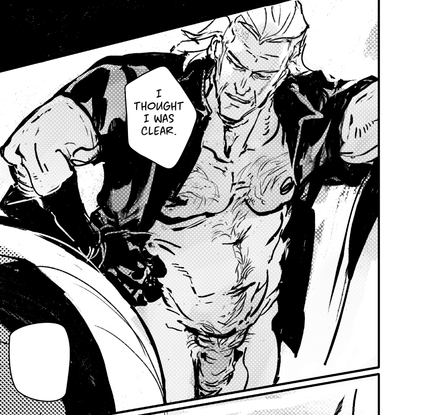
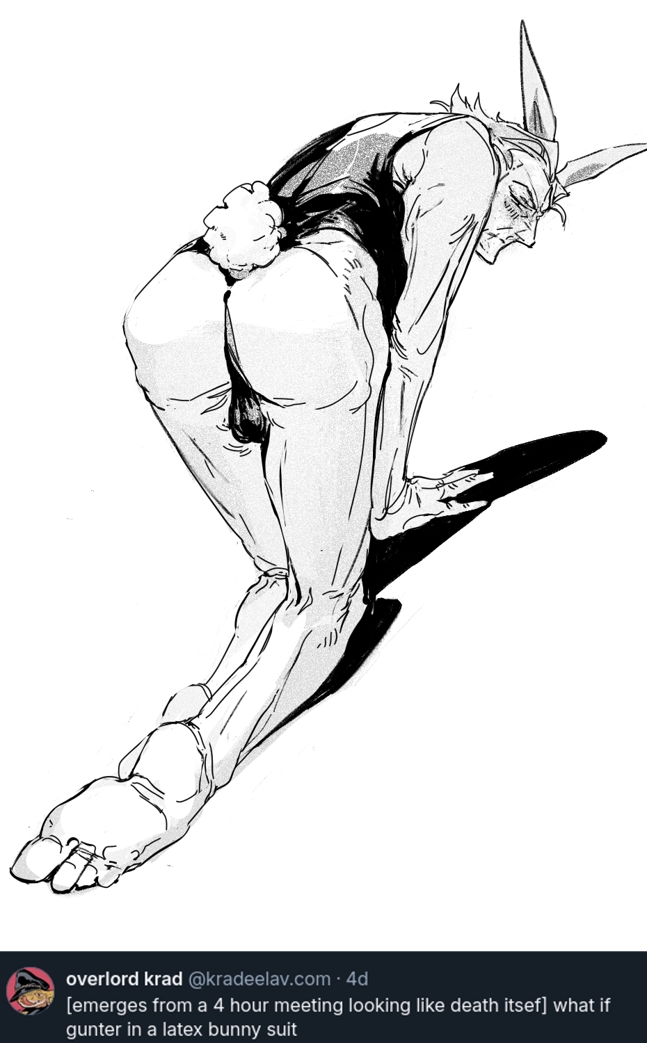
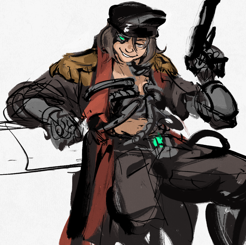
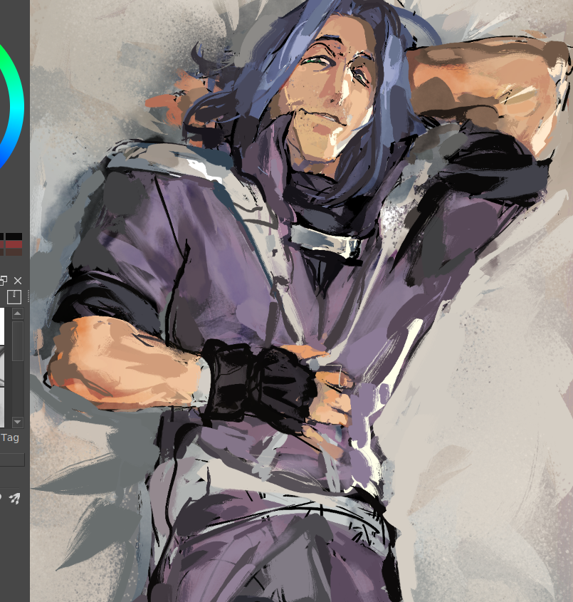
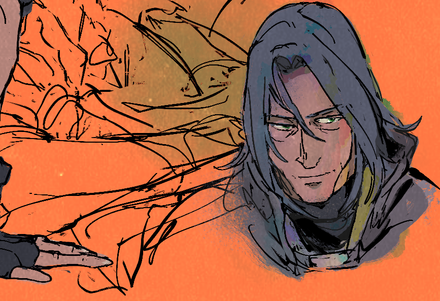
sometimes i forget that 'daddy i made a child's toy from a whip gunter' actually wielding whips in combat is only a headcanon #fefates
2025.05.03 21:52:30 編集
2025年4月 この範囲を時系列順で読む この範囲をファイルに出力する
2025.04.26 22:38:33 編集
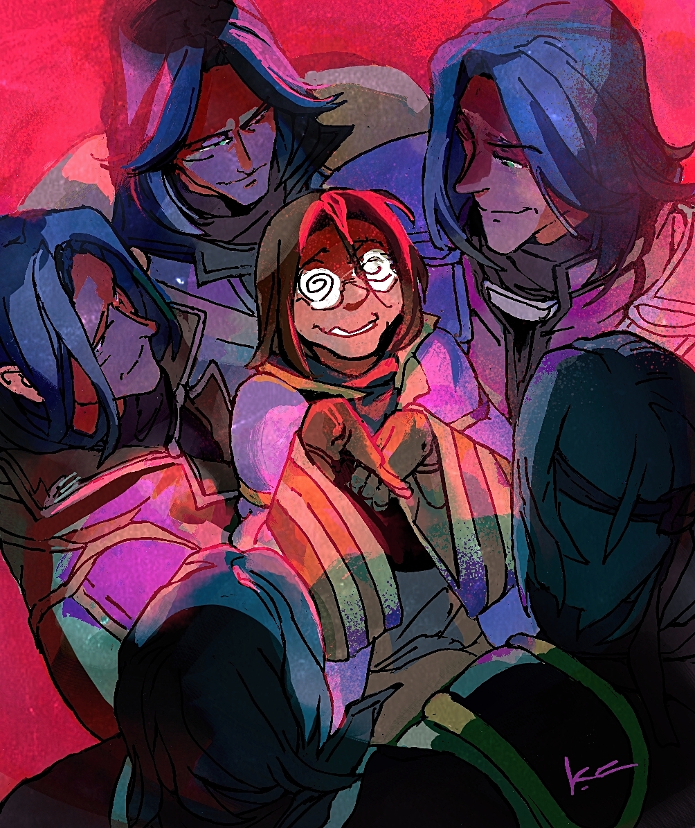
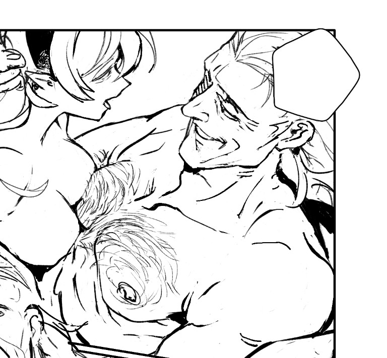
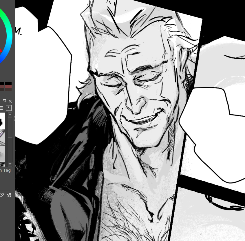
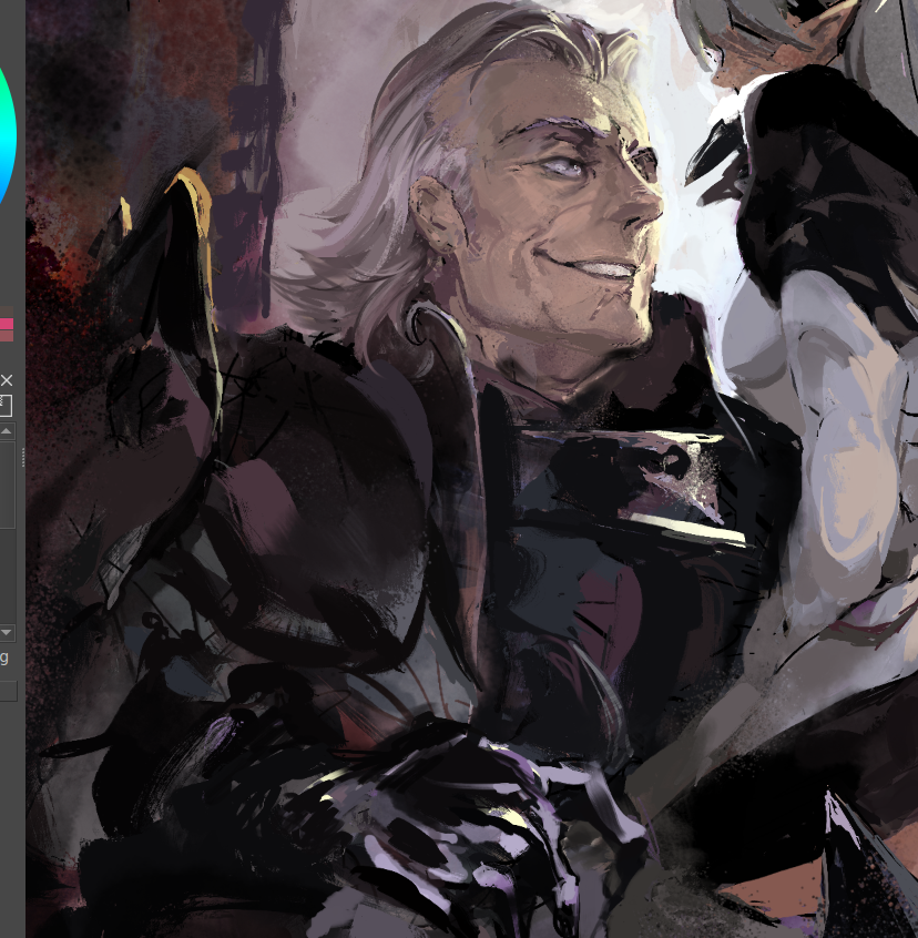
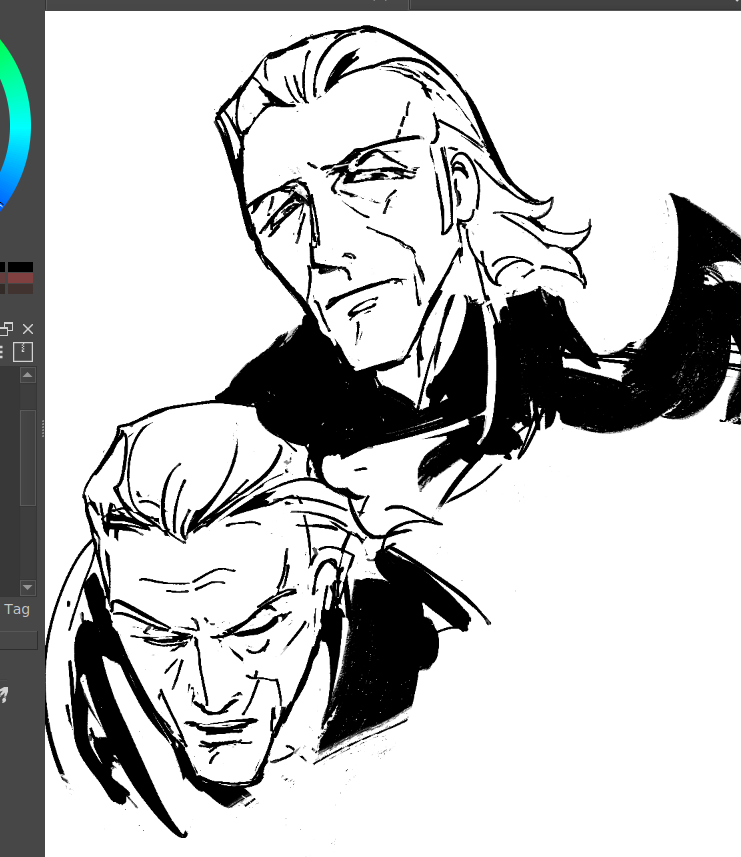
aimee, astrid, and calill chatting. experimenting with some color styles... not wholly satisfied but i like the direction.
#fetellius
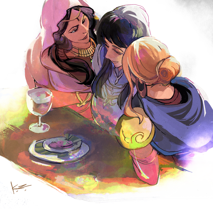
#fetellius
2025.04.26 15:55:09 編集
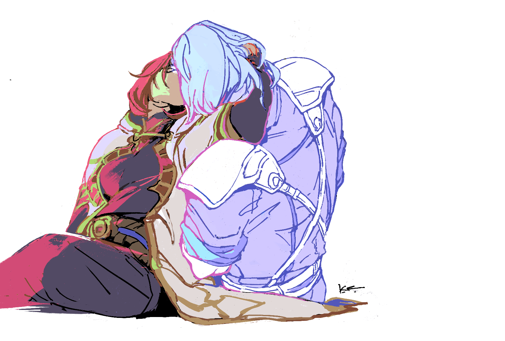
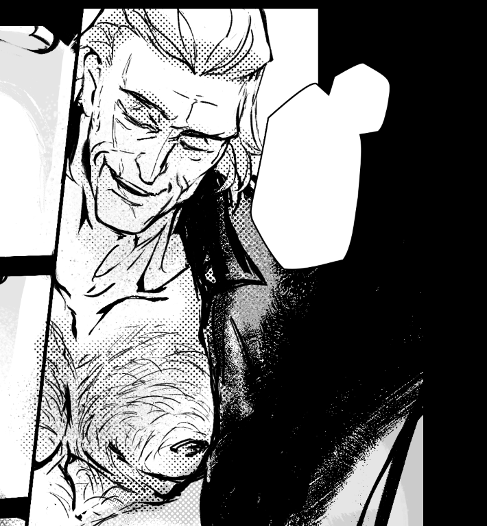
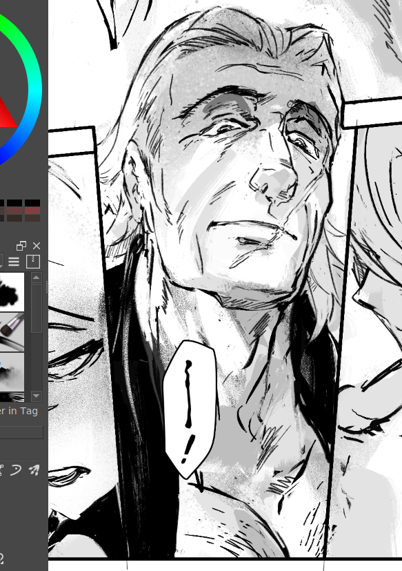
yumejoshi
(+ obligatory #zihark tag)
this started off as something funnier as a good natured meme rather than it being as off kilter as it ended up lol - honestly i love it .
i make no secret that i love selfshipping (yumijoshi) as much as i love weird fucked up media. i also feel like people either approach yumijoshi as a concept with either a totally negative (and to me unfair tone given the history) or an equally flat "positive" tone . to be completely honest both rub me the wrong way.
and ... i'm going to say this wrong but i think it's fun to occasionally poke at the slight ... unreality? with a stick.
both internally consistent with the little daydream stories i've got going on, and both in a larger societal sense without it being too ponderous in a morality sense. that's boring. let yumijoshi be lil freaks basically.
anyway i blame a little of these vibes on my recent evangelion rewatch. x)
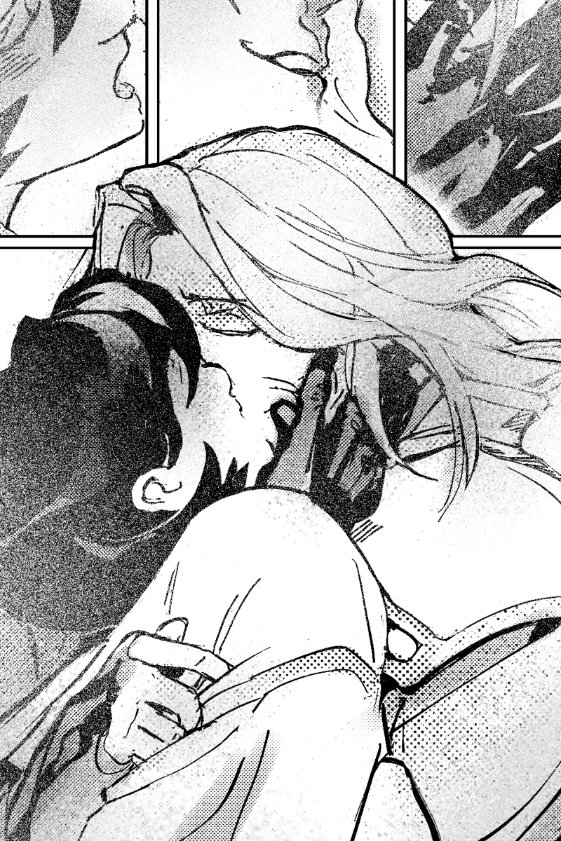
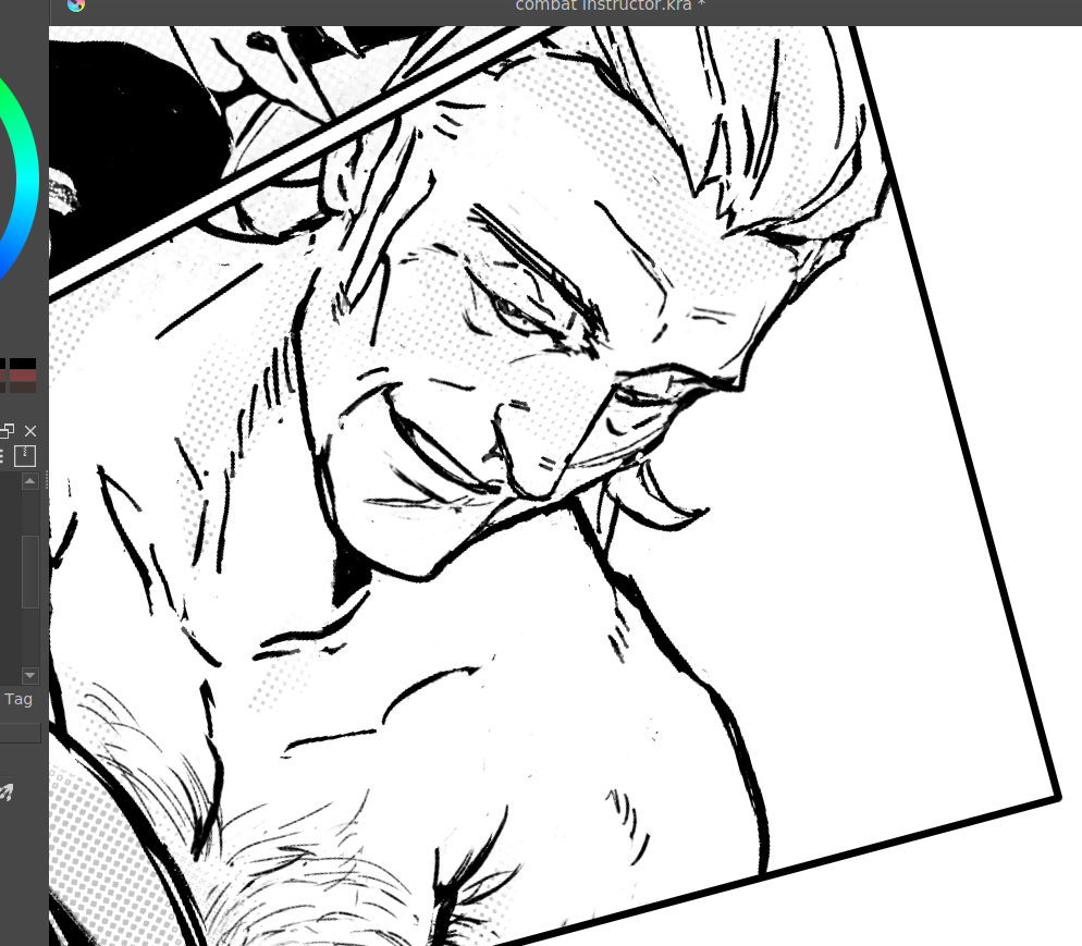
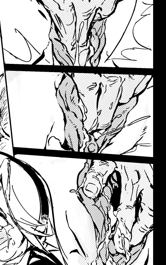
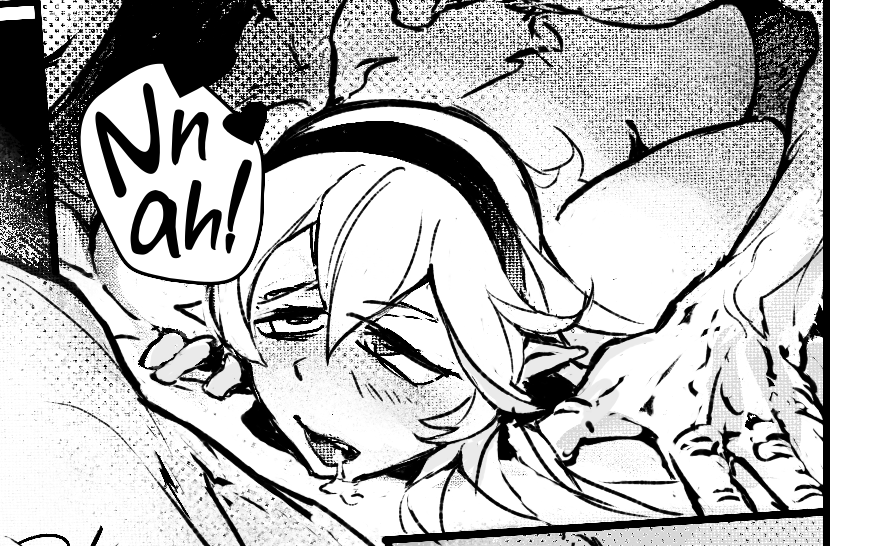
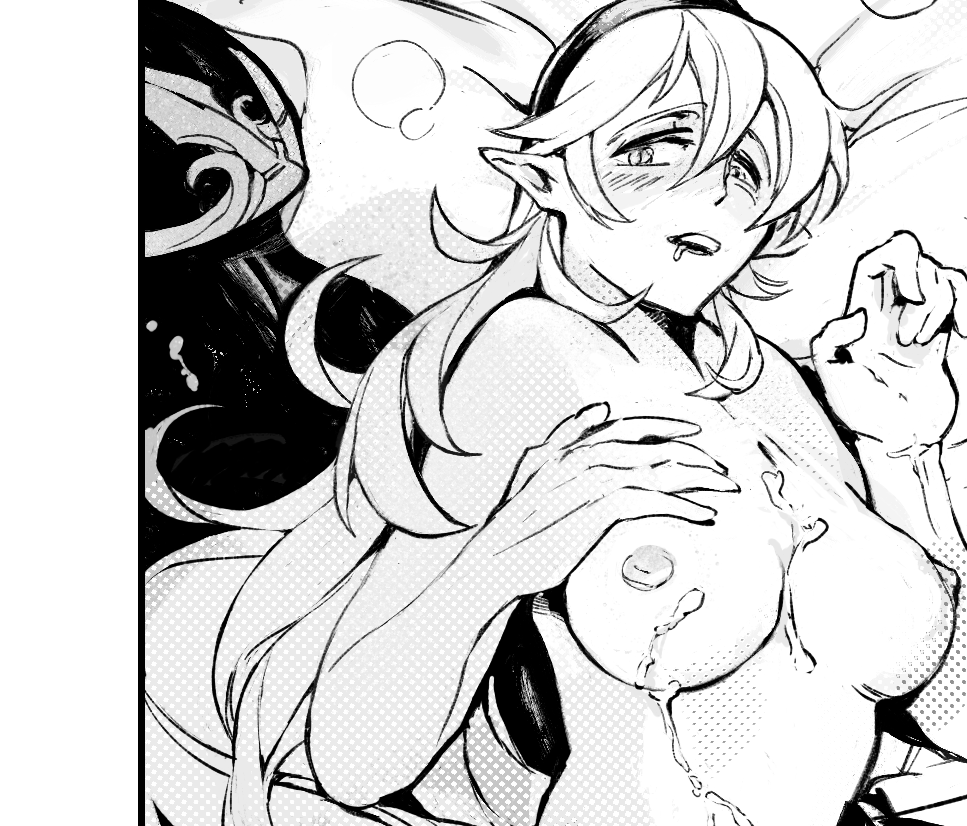
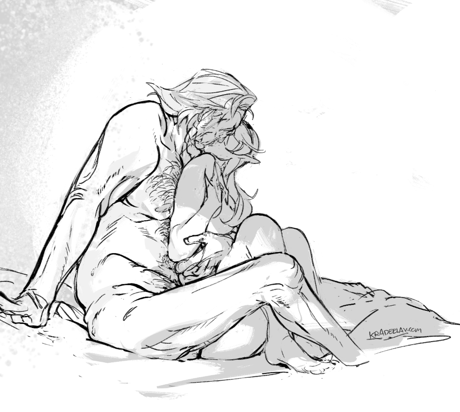
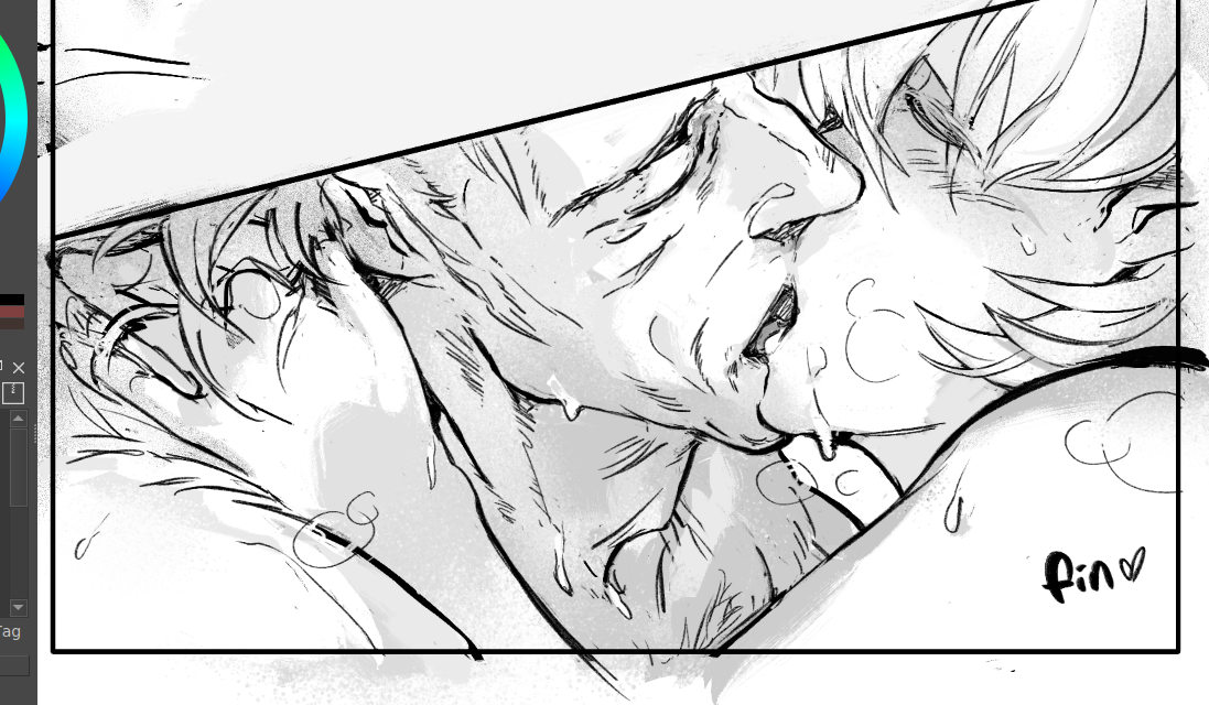
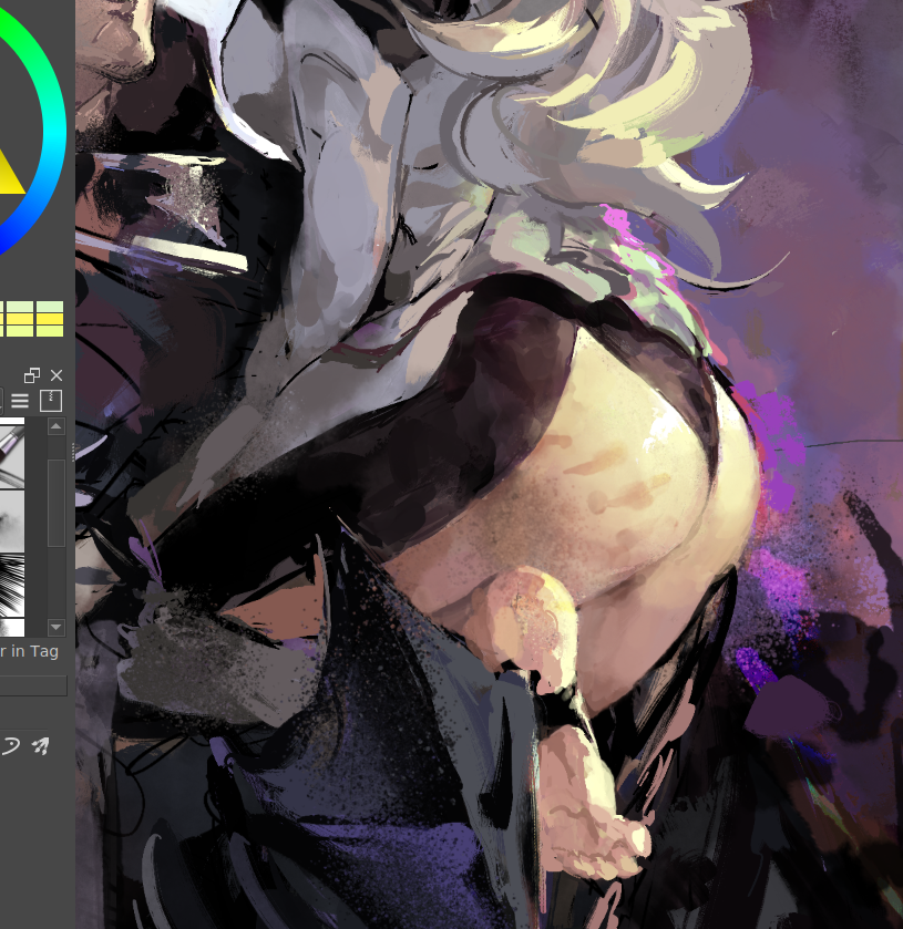
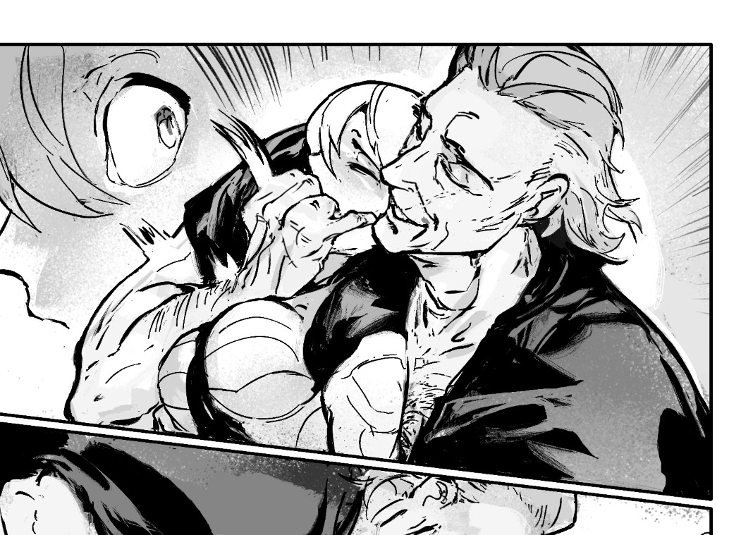
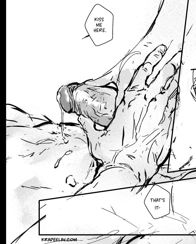
spoils of war
gunter/corrin, #fefates , bad ending
Creator Chose Not To Use Warnings
i genuinely enjoy drawing my favorites as rapists... it's interesting poking at why.
that rare pleased fire-burn of 'oh this is provocative with thought. this has substance. (how is such an malicious action depicted substance?) there's a call to the darker parts of the id that recognizes kin. all of us have such potential, even as we wish otherwise.
and it's hot tbh. fuck me if i get a ladyboner from it ig.COLLAPSE
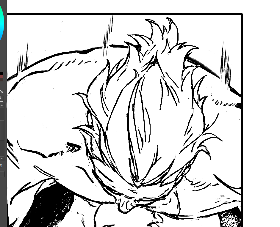
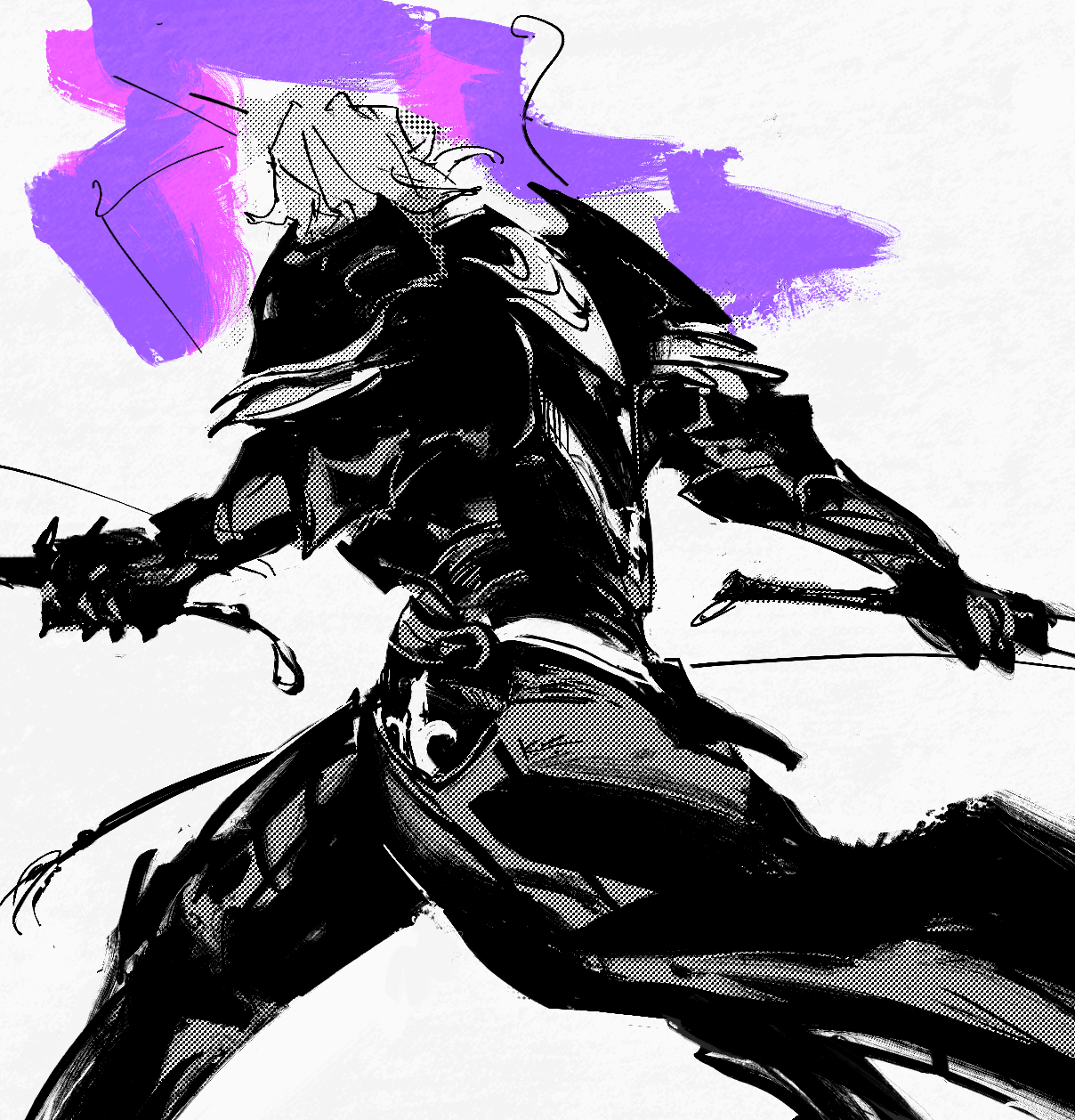
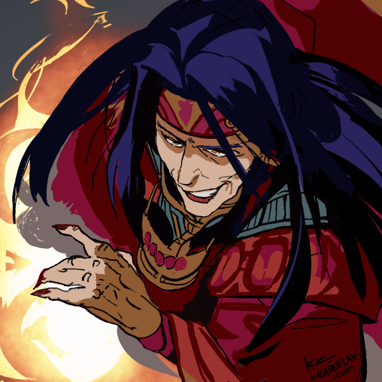
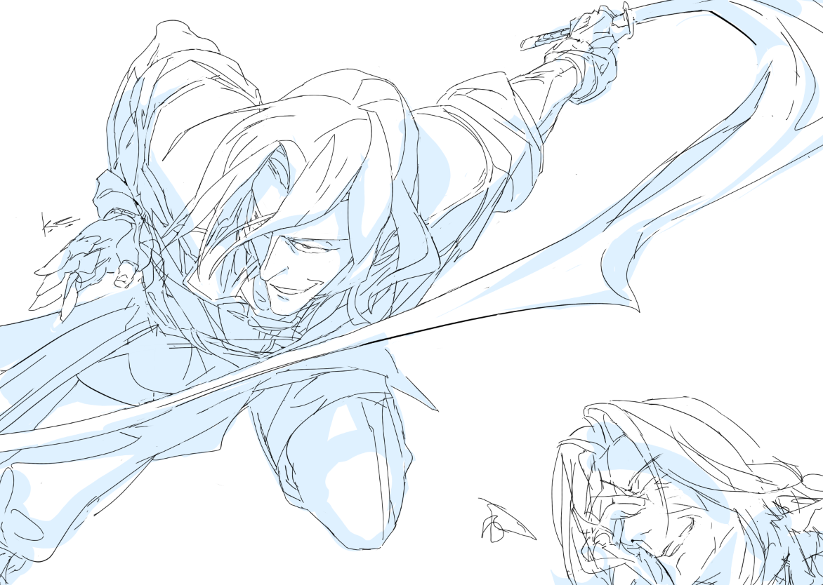
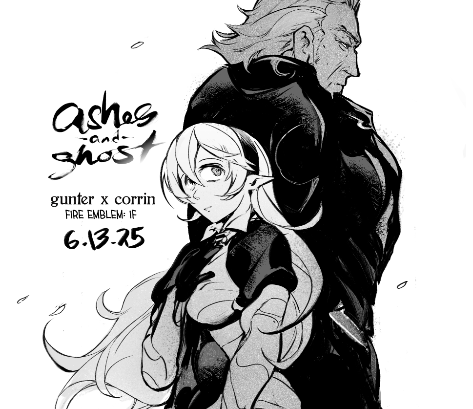
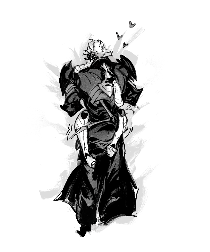
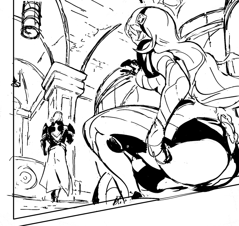
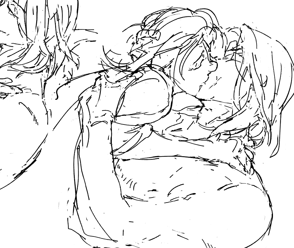
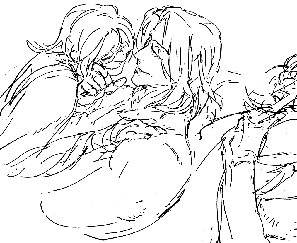
some dear friends were discussing 'what if FEH did aged up banners and weren't cowards' ~ #fetellius
2025年3月 この範囲を時系列順で読む この範囲をファイルに出力する
2025.03.07 15:42:16 編集
2025年2月 この範囲を時系列順で読む この範囲をファイルに出力する
2025.02.23 22:56:03 編集
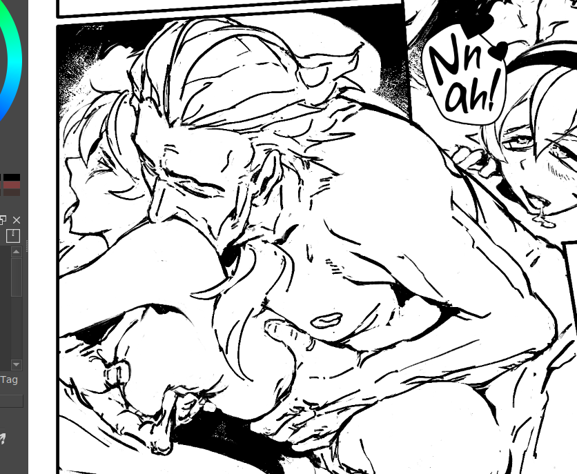
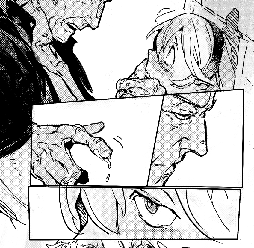
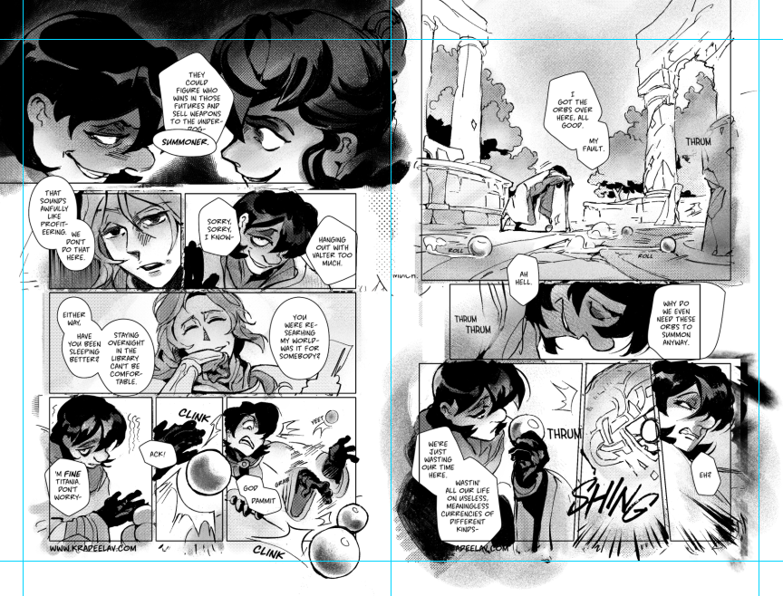
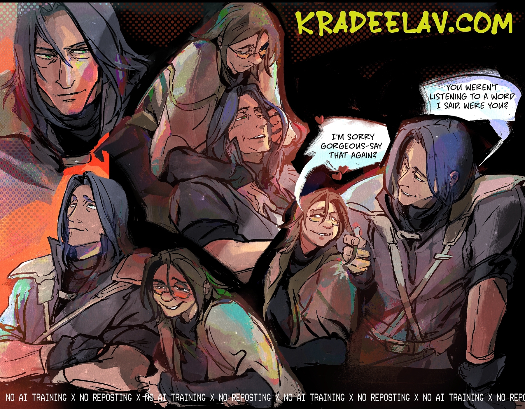
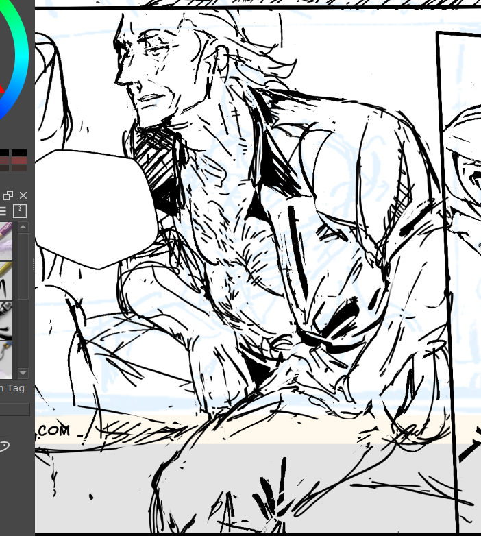
Here's my guide to making comics with Krita, down to the details such as layer setup, borders, speech bubbles, and SFX.
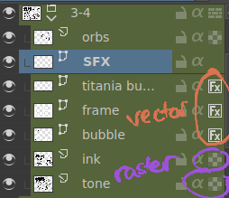
preface: it took me at least a year to figure this process out; but once when you've figured out the system & a template, it's smooth sailing. let's use this finished spread from the selfship comic last year to go through the process:
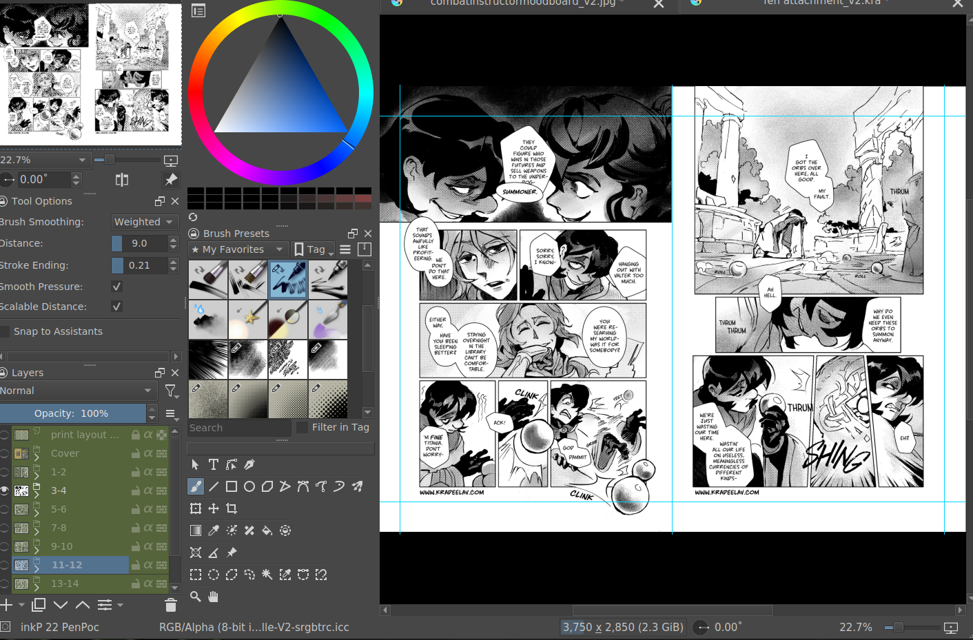
i'm going to assume a certian level of digital program proficiency (knowing what layers are, having a general idea of what vector vs raster graphics are, etc) since otherwise this post would be a book. rest of the post under the cut; this one's going to be a long one as is.
let's start with talking about the layers for a single page of the above comic image.
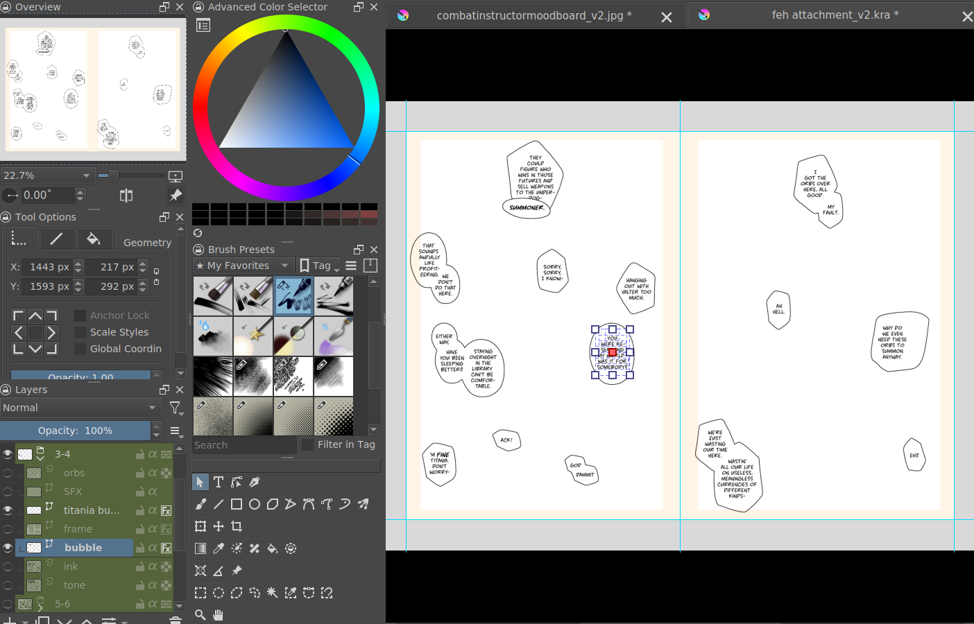
(ignore the "orbs" and "titania bubble" layers - those were oddities for this specific spread.) Going from the top downwards:
- SFX - sound effects. this is an optional layer to have if you don't have a lot of sound effects. you can use either render the sound effects by drawing them out (raster) or vector SFX; whatever you're most comfortable with. more on that below.
- frame - this is the comic page borders.
- speech bubbles - self explanatory. contains both the text inside the bubble and the bubbles themselves.
- ink - main lineart & drawing layer; self explanatory.
- tone - the shading layer.
- (deleted) ruff/sketch - this is the sketchy thumbnail layer that is imported when i first start working on each spread, and naturally gets deleted when the lineart starts looking good on its own.
so!
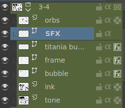
there's two types of digital rendering krita can do: raster (most similar to drawing with a pencil or tablet) and vector (computer draws mathematical lines and shapes and text that you can manipulate). a lot of programs fully specialize in one or the other but the killer feature of krita is it can do both on a single page; you just need separate layers depending on the rendering..
that's what this "fx" symbol stands for by the way - these are the vector layers....
... and the symbols circled in purple clue you in that they're raster layers (ink, tone, sketch) where you do the actual drawing. with me so far?
speaking of those:
borders/frame
here's what the borders layer looks like + (the print layout layer above everything in black/yellow). the print layout layer is really only useful if you're physically printing this comic (it's basically bleed/trim if you've heard of those terms, ignore this otherwise).
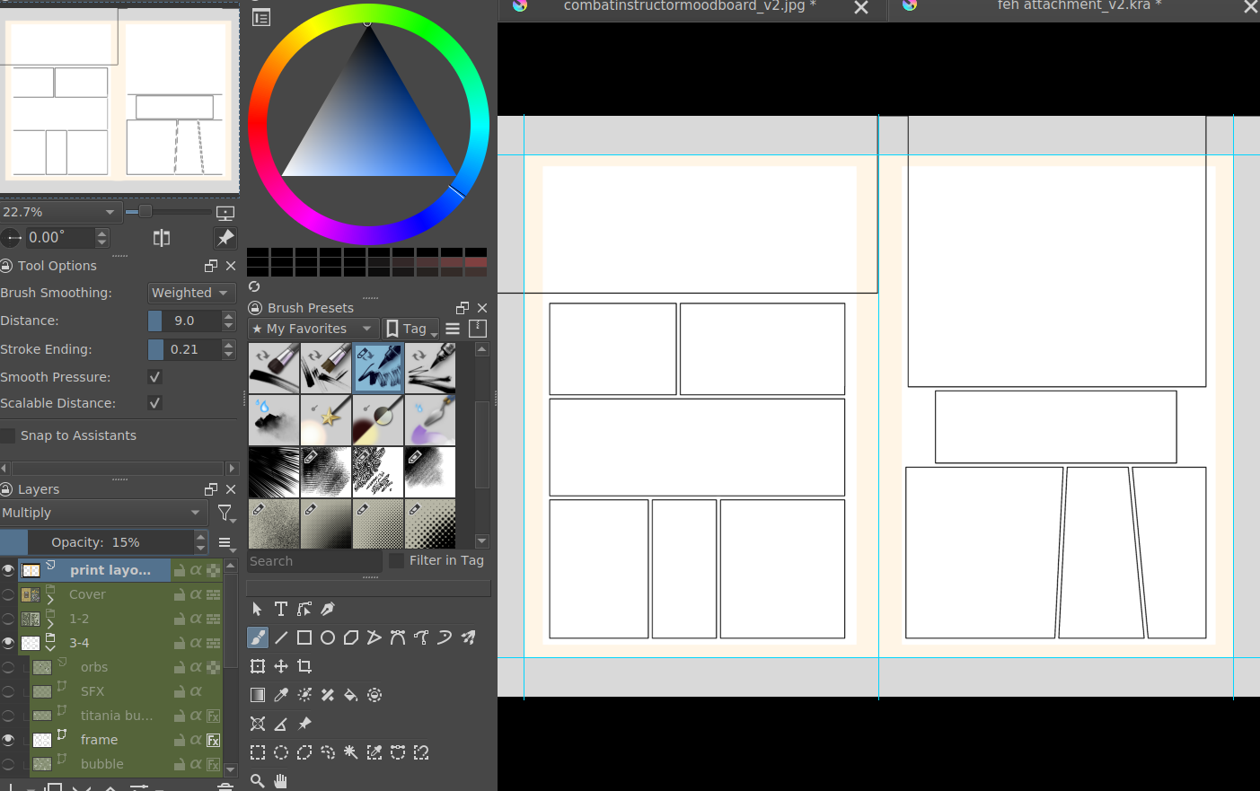
i really struggled with doing borders in krita until finding this tutorial. since the thing is i make a lot of last minute changes. i need to be able to move and edit borders around easily if a panel's not working for me. so the method above makes it incredibly flexible to just ... up and move one, or to make a gutter wider.
i also really need to be able to see what's behind the borders while i'm drawing it to check anatomy sometimes -- the beautiful thing is you can simply turn the layer style to "multiply" and it's effectively transparent with one click.
like this, voila!
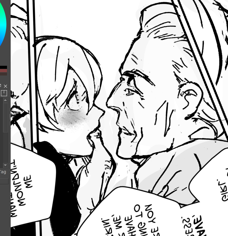
lettering
here's the lettering layer(s) with one bubbles' text selected.
fair warning: krita is absolute ass with the text tool. it's the biggest failing but in newer versions i do believe they're slowly working on improvements. thankfully this program can do just enough to letter bubbles.
essentially, i use the same trick as the frames shown in the video above. if you slap a "layer style > stroke" on the whole "bubbles" layer, that's where that 2px black border comes from, and that layer-style-as-a-border "follows" every bubble so it's consistent.
(rule of thumb aesthetics-wise is speech bubble borders should be slightly thinner than frame borders, and on average about as wide as your lineart.)
SFX (sound effects)
technically you can hand-ink all of your SFX if vector art scares you or if you don't intend on doing much, but the vast majority of pros use vector work for efficiency. hentai/erotic work also has a lot of SFX versus other (non-NSFW) genres for the immersion factor with bodily functions.
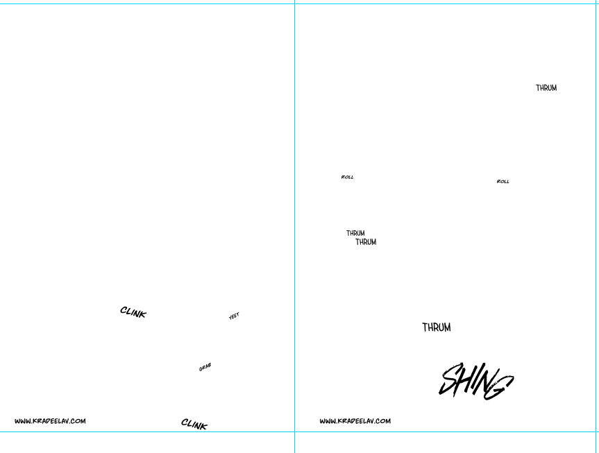
the spread above didn't need a lot, though. as you can see it's mostly the inorganic orb clinks and then the big SHING. (i put my for-the-web-kradeelav.com signature on the same layer for laziness).
here's part of my current sfx library below just to show you what i start with for erotic strips; usually i start with some base fonts and start moving the letters around individually.
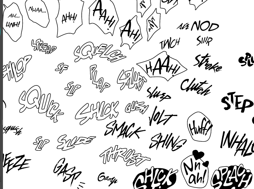
(a lot of these are redone for every project; there's some in here that are already "outdated" in my eyes.)
miscellaneous
my favorite inking brushes are from this free resource pack. my favorite halftone (shading) brushes are from this (also free).
thanks for reading! COLLAPSE
preface: it took me at least a year to figure this process out; but once when you've figured out the system & a template, it's smooth sailing. let's use this finished spread from the selfship comic last year to go through the process:
i'm going to assume a certian level of digital program proficiency (knowing what layers are, having a general idea of what vector vs raster graphics are, etc) since otherwise this post would be a book. rest of the post under the cut; this one's going to be a long one as is.
let's start with talking about the layers for a single page of the above comic image.
(ignore the "orbs" and "titania bubble" layers - those were oddities for this specific spread.) Going from the top downwards:
- SFX - sound effects. this is an optional layer to have if you don't have a lot of sound effects. you can use either render the sound effects by drawing them out (raster) or vector SFX; whatever you're most comfortable with. more on that below.
- frame - this is the comic page borders.
- speech bubbles - self explanatory. contains both the text inside the bubble and the bubbles themselves.
- ink - main lineart & drawing layer; self explanatory.
- tone - the shading layer.
- (deleted) ruff/sketch - this is the sketchy thumbnail layer that is imported when i first start working on each spread, and naturally gets deleted when the lineart starts looking good on its own.
so!
there's two types of digital rendering krita can do: raster (most similar to drawing with a pencil or tablet) and vector (computer draws mathematical lines and shapes and text that you can manipulate). a lot of programs fully specialize in one or the other but the killer feature of krita is it can do both on a single page; you just need separate layers depending on the rendering..
that's what this "fx" symbol stands for by the way - these are the vector layers....
... and the symbols circled in purple clue you in that they're raster layers (ink, tone, sketch) where you do the actual drawing. with me so far?
speaking of those:
borders/frame
here's what the borders layer looks like + (the print layout layer above everything in black/yellow). the print layout layer is really only useful if you're physically printing this comic (it's basically bleed/trim if you've heard of those terms, ignore this otherwise).
i really struggled with doing borders in krita until finding this tutorial. since the thing is i make a lot of last minute changes. i need to be able to move and edit borders around easily if a panel's not working for me. so the method above makes it incredibly flexible to just ... up and move one, or to make a gutter wider.
i also really need to be able to see what's behind the borders while i'm drawing it to check anatomy sometimes -- the beautiful thing is you can simply turn the layer style to "multiply" and it's effectively transparent with one click.
like this, voila!
lettering
here's the lettering layer(s) with one bubbles' text selected.
fair warning: krita is absolute ass with the text tool. it's the biggest failing but in newer versions i do believe they're slowly working on improvements. thankfully this program can do just enough to letter bubbles.
essentially, i use the same trick as the frames shown in the video above. if you slap a "layer style > stroke" on the whole "bubbles" layer, that's where that 2px black border comes from, and that layer-style-as-a-border "follows" every bubble so it's consistent.
(rule of thumb aesthetics-wise is speech bubble borders should be slightly thinner than frame borders, and on average about as wide as your lineart.)
SFX (sound effects)
technically you can hand-ink all of your SFX if vector art scares you or if you don't intend on doing much, but the vast majority of pros use vector work for efficiency. hentai/erotic work also has a lot of SFX versus other (non-NSFW) genres for the immersion factor with bodily functions.
the spread above didn't need a lot, though. as you can see it's mostly the inorganic orb clinks and then the big SHING. (i put my for-the-web-kradeelav.com signature on the same layer for laziness).
here's part of my current sfx library below just to show you what i start with for erotic strips; usually i start with some base fonts and start moving the letters around individually.
(a lot of these are redone for every project; there's some in here that are already "outdated" in my eyes.)
miscellaneous
my favorite inking brushes are from this free resource pack. my favorite halftone (shading) brushes are from this (also free).
thanks for reading! COLLAPSE
2025.02.13 18:21:10 編集
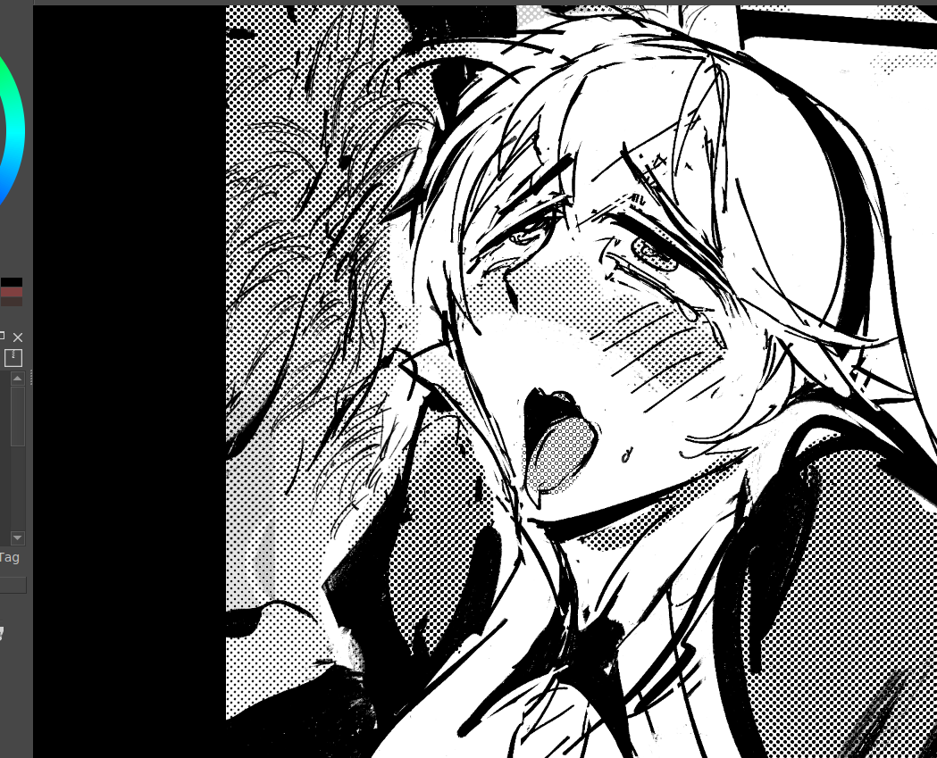
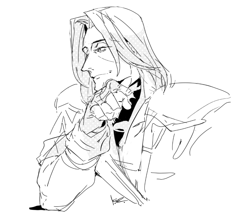
been experimenting with some coloring/finishing techniques and i'm so impressed with krita's modulo layer effect ...
it's really fun studying the mathematics behind this class of layer effects and surmising why it works so well in the above screenshot (on top of "flat" cell-shade drawing to add just enough of randomness.) i think it has to do with the logic of gradients but then the abrupt switch to the next gradient, versus one samey blob of color.
"painting" that layer effect on with a watercolor brush (introducing another level of randomness) has some serious mileage! especially if you can still eyeball the general intensity/hue.
one problem i've always had with digital drawings is how stiff and lifeless it can feel without the randomness inherent in physical paints. a lot of effort behind digital brushes is the creators deliberately re-introducing artificial randomness - but sometimes it still feels odd or not enough. wet paints and ink separate, markers fade over time, entropy is its own artisan, in a way.
#zihark #fetellius
2025年1月 この範囲を時系列順で読む この範囲をファイルに出力する
Powered by てがろぐ Ver 4.2.0.